
TASK 8
Learning Outcome 3 (U20): Be able to produce the planned media components
M3 (U20): Explain how the created media components comply with the codes and conventions of the media sectors
D2 (U20): Demonstrate how the technical and aesthetic properties of the media components meet the client brief
Billboard


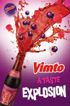
For the berry blitz billboard advertisement we really focused on the size and colour of the ad as this is what we saw stood out most in the billboard ad we researched. The colour of the billboard was vital as the colours a huge part of the theme of our brand and product. The colour of the product will be what is recognisable and the audience recognise when they browse for the product. The colour is also important as it represents the flavours of the drink. This subconscious connection from colour to taste is very important as it creates a strong link between the advertising and the brand and product itself which is really important for that of a billboard ad as a lot of information needs to be communicated in very little words and rather conventions.
The product placement in the billboard is arguably the most important part as it communicated the most information with the audience with just an image. It shows the most in just an image and contains the logo, can and colours which are associated with the brand. Again, this is important as the billboard will be seen in passing rather than analysed deeply so having the product placed in full view is really important and allows the audience to recognise the can in shops. From researching other companies’ convention and how they use billboard advertising we put huge emphasis on the product placement as this is most important for the audience to see. On the billboard you can see that the can is placed central and is the easiest thing to spot.
On the billboard ad we put a lot of emphasis on the slogan and the typography used. The font used throughout all of our work is the same so it can be associated with the brand. ‘Rewind your taste buds’ is the brands slogan and is used to link to the product and the story behind the brand. It is placed in large writing above the can and is curved over it rather than straight. This is purely for aesthetic effect as we saw a lot of billboard ads with this affect. The colour of the slogan is also in a font that is consistent with the brand which allows it link closely with the brand in that sense too.
Along the bottom of the billboard ad I have placed the social media links for: Facebook, Instagram and twitter. The use of social media for our audiences is vital as it means they can follow the brand further online. With our primary audiences being 30 year olds they are more likely to be using Facebook a lot, whereas with the secondary audiences who are younger teens they will use Instagram and twitter. The integration of social media into the brand shows that we are aware of our audiences and what there hobbies are etc. Having this social media integration also links to the brand using traditional forms of advertising and making them digital.
Magazine advert

For the magazine ad we really focused on the product placement and slogan. We researched other magazine adverts and found that there isn’t much writing and there is huge emphasis on the visual aspects of the ad. Although it is in a magazine meaning people will look it for a bit longer than a billboard, a lot of information still needs to be communicated in a short time as people lose interest very quickly and have very short attention spans to ads with a lot of writing in therefore shaping our ad into a purely visual ad with short text which consist of the slogan and the social tag.
The most visible aspect of our ad is the can in the middle. We put a lot of focus into the product placement as this is arguably the most important thing for the customer to see and acknowledge. The can is the largest thing in the ad and is the clearest thing to make out.
The colour pallet was very important in the magazine ad. We decided to have a plain white background to hyperbolise the colourful tones of the can and the graphics surrounding it so the main focus was on the colours of the can and the graphics which link to the brand closely. This can be seen with the social tags too as they are black against the white background therefore drawing more attention to the product.
For the typography we kept with the same font that we used throughout our campaign which is important as it means people link the font to the brand and product. The font in the magazine advert has a glitch effect on it to make it stand out bit more on the white background however we still didn’t want the font to be the most important and visible thing as the product spotlight was our goal throughout.
The magazine advert links to our target audiences as it contains little information and really focuses on visuals which is important in the sense as our audience of teenagers have a very low attention span therefore making the ad appealing to them.
Video advertisements

The video ad starts off being black and white which is representative of the actor being old. As the drinks story is based around making you feel younger as you drink it. The start being in b&w this puts emphasis on the mood associated with the drink and how you feel down before drinking it.
The first scene is long angle wide shot of the actor walking down an alleyway with her head down and acting solemnly, complimented by the black and white filter of the video it gives the audience a sense of sadness and depression before the consumption of the drink. This combination of editing and colour pallet usage adds a feeling of sadness to the first scene which will put far more emphasis on the happier parts of the video advertisement.

The next scene is the actor walking up to the product and picking it up. The camera shot changes to a close up shot of the product which puts more emphasis on the can and the brand. The filter is still black and white as the actor has not consumed the drink yet. The
Transitions between frames were just basic cut frames which made them simple and effective. The goal for this shot was to put heavy emphasis on the product and introduce it into the advertisement.

After the actor consumes the drink you can see a visual change in there expressions leading to happiness. This close up of the actors face allows for the audience to see the way it makes a human react which links more to them as it is representative of the emotions involved with the drink and the way it makes you feel.
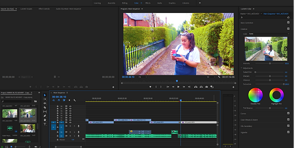
Here is an image of the transition on the editing app where there is a change in the music and also a change of the scenes filter.
This is after the consumption of the drink.
the change of colour in this part of the ad represents a change in mood and emotion which is important as it purely an audio visual ad with no speech, these changes are used to make it clear to the audience what is going on and how they should perceive the change. the diegetic change in this scene also, the music changes from a mellow song to an upbeat song to further the audiences understanding of the emotions the actor is feeling.

Another close up of the actors face after the consumption of the drink. This scene includes product placement and raw emotion which links the drink to emotion caused by the drink at the time. In this close up of the product placement and the actors emotion is a great representation of how the drink makes you feel. This representation is accompanied by in sync dancing from the actor with the music.

The final scene is a standing long shot of happy music playing and the actor dancing toward the camera. The color enhancements and costumes gives a sense of retro and authenticity to the ad which is linked to the brand image.
two other actors join the middle actor and dance toward the camera here, not actors sport aesthetic 90s wear which is linked closely to the brand image. The ad ends with all actors going off camera and the berry blitz logo being put on the screen with the social tags underneath.